Newspaper Analysis

“Photojournalism is a unique and powerful form of visual storytelling originally created for print magazines and newspapers but has now morphed into multimedia and even documentary filmmaking. Through the internet, apps and the mobile device explosion, photojournalism can now reach audiences never before imagined with immediate impact, while continuing to write our visual history and form our collective memories.” – Ed Kashi
IMG_0856

The lecture provided a critical study of how we view and understand key global events by interrogating historical and contemporary examples of significant moments in time as captured and communicated by designers, photojournalists and photographers and how they are presented in the media.

The Guardian

the guardian

The guardian has produced a striking graphic to represent those who have “fallen” in the paris attacks. The colour black has the typical association with death, evil and mystery. Its seen as being a mysterious colour and is associated with fear and the unknown. In general black has a negative connotation to it. For these reasons the colour black was used symbolically for the outline of the victims who sadly died. In contrast to this, the images used to represent the victims are quite happy images perhaps to show how content they were in their life before they were ripped from their everyday lives.

The title is quite striking as its not all in capitals and thus making it not quite in your face as a sign of respect and making the image speak louder than words. The serif font used gives it a certain restrainment about it, giving a more muted visual presence.

The guardian title is at the bottom of the images which shows a sign of respect by putting the victims first before their profitable needs, whereas most titles are at the top of the page.

The 3 bullet points down the side on the left give a brief summary of the main points from the article showing what to take away from the news report. A brief summary of the inside of the magazine is also included  with strong and bold titles making people want to read on – “The victims: the people who found themselves in the wrong place at the wrong time”.

It has a Mosaic layout of the images with each one adding to the final picture. The missing people leaves a gap in the mosaic or the Gaps in peoples hearts.

The Times

the times

With the Times newspaper the title is still on top, to allow users to be able to easily distinguish which agency has published this exclusive story. Interestingly the “Worlds most wanted” is not in capitals whereas in old-fashioned western posters the “WANTED” sign is always in caps and written really bold to show urgency and danger. The image of the criminal is fear evoking but has been subdued, making him not look that scary but just adding awareness to him as a person. His eyes have been edited to be even whiter and thus making them even more eye catching so people are drawn to his face (hopefully remembering it) and giving the feeling like they are following you around.

The face is the most noticeable part on the front page however the way the text has been placed around it and their style can at points just make the criminal look like a normal person. The combination of images is almost unnecessary as the only impacting photo is the one on the far left where the face is in focus and visually readable that he’s is the criminal on the run. The other images aren’t explained clearly as to what they should be.

The only information you take away from it is that he’s the worlds most wanted man and that SAS will be ordered onto the streets if jihadists hit Britain. Its interesting that “International manhunt to find surviving paris attacker as France launches Syria airstrikes” is among being one of the smallest fonts used on the page when realistically its quite an important point to be broadcasting.

Los Angeles Times

CA_Los angeles times

“MANHUNT IN EUROPE” is a big and bold statement headline for an article but its so striking it makes the reader want to continue. The font is aggressive in comparison to the words themselves which are very dramatic and fear invoking. THREAT, MANHUNT, ATTACK are all words which are very strong forceful and urgent. The image of a tri-coloured eiffel tower is central and very long & resulting in a minimal amount of text either side to catch your eye and pull the audience in straight away. This technique makes you know instantly what the article is about.  “Possible mastermind, other suspects were known to French police” is a very intriguing statement and therefore making you query if you know everything you thought about this attack.

The contrast between the threatening feel of the language and the tranquil image are very strong. The image doesn’t seem to back up the horror that has been expressed in the title, perhaps to show the strength and unity through tough times. The image they have used is a couple days after the attacks as the eiffel tower was not lit up in the colours to represent the flag as it stood in the darkness to show solidarity.

Not only has the paris attacks been exploited in newspapers, it has also gone global all over social media. One of the most recognisable symbols from this event is the Peace for paris logo designed by Jean Jullien (as seen below)

Jean Jullien is a French graphic designer currently living in London. He comes from Nantes and did a graphic design degree in Quimper before coming to London. His practice ranges from illustration to photography, video, costumes, installations, books, posters and clothing to create a coherent yet eclectic body of work. – http://www.jeanjullien.com

Similarly #prayforparis went global all over twitter, with people leaving their thoughts and prayers with everyone using this hashtag. However there was  a Pray for paris company which opened up: http://www.prayforparis.com which was advertising itself to be a Unisex clothing line offering extremely limited fashion pieces at the highest quality. Focused on limited edition t-shirts. With 20% of profits will be donated to the french red cross.

Drawing for Research

This project started off with situating drawing in context with Graphic design. The first introductory session explored – What do we mean by a sense of space & place? from this we then continued to develop a language in drawing according to our intentions as designers. We also looked into developing drawing and to utilise a more critical capacity focusing on function and purpose.

To try and expand our thinking space we then went onto explore the world we don’t see. Things such as the Universe, Scale + time, who are we?/ who am I?, Cosmology – expanding the universe & can we explore space & typography were all topics that were taken into consideration in this session. Different drawing techniques to look at were things such as Abstraction, Observation, Non representational and 2 dimensional which we could all link to time and space.

After looking at drawing in the 21st century we then went onto perspective drawing. Focusing mainly on the use of grids and how they can help us make sense of a chaotic world. From looking at perspectives we initially started with a 2 point perspective drawing of stairs which was good to reminder of how to do it.

FullSizeRender-3

After a 2 point perspective we then moved onto 3 point perspective of which I did this drawing of a building, however there are some lines on the image that are in the wrong place. On reflection I would draw it again or draw another image perspectively in the same way. Below was my attempt at a 5 point perspective drawing showing the urbanised world from above.

IMG_0928

These are some perspective experiments done with typography to change the way the words are written on the page by adjusting the angle and tone to create a 3D feel. When photographed I feel as if it looks more effective than when seen done on the page.

FullSizeRender-4

The next topic we went onto with Amanda was understanding the universal principles of design and how these are based on the laws of geometry and physics which have stayed the same for centuries. We discovered that drawing is thinking about design. Things such as typography are based on grids and spaces to achieve their structure and form. We looked at complexity, language and linguistics which is based on a number of different systems & structures in language and applied that to graphics design principles.

We studied language in composition and the historical forms of language and how these developed graphically & typographically into these styles. I have constructed a composition on the basis of geometry, structure & form and thus stretching out my conceptual thinking. I had to construct my design work together using form, function and conceptual ways to allow the language & design work together.

From this session I noticed systematic grids are everywhere which has changed my visual thinking. With out knowledge were were able to produce more sophisticated abstract work from understanding the golden section which would be altered in relation to different paper sizes.

Ultimately looking at how relevant geometry from Edward Wright was, this then lead onto different kinds of strokes one can make from drawing and language. I’ve also learnt about basic type classification in context with my work.

For this second section I knew I wanted to do something in another language and the one most recognisable to me is French. I looked into how the different languages vary when written which is where I came up with the idea of Vowels.

French uses several accents in their vocabulary: grave accents (à, è, and ù) and acute accents (é). A circumflex applies to all vowels: â, ê, î, ô, û. A tréma (French for dieresis) is also applied: ë, ï, ü, ÿ. Two combined letters (called orthographic ligatures) are used: æ and œ.

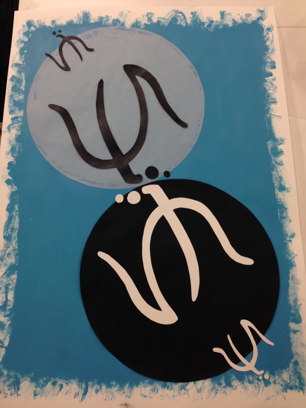
From this I then decided to stick with vowels, so I focused on the merging of the letters to create abstract conceptual symbols which are intriguing to the eye. The main symbol I comprised was with the merging of a “u” upside down & the letter “ï” to create something that looked quite Japanese. I then had the basis to a design idea so I had a little play around on photoshop with colours, collaging and editing to see what layouts I came up with. This was just a way of saving time by achieving very different outcomes.

compositional layout

Below is my final composition of the artwork expressing french vowels. It took me a while to find a placement of the symbols and circles on the page of which I was happy with.

IMG_0828-1

I also decided to do a purely plain typographic piece which would state: French Vowels – The contrast in languages and their effect on vowels. I did this piece focusing my inspiration mainly from french wines and the labels produced for them. The colours chosen are that of the french flag, blue white and red, with the vowels a,e,i,o,u in red.

Branding

This lecture was an introduction to branding to provide consideration of branding history, theory, key brand examples and related marketing perspectives and terminology. The session questioned the power of branding and how we understand and relate to brands.

We were then provided with a brand at random, of which we then went to research again with a brief overview of the company and their history on one side of the luggage tag and then on the back all the words that come to mind in association of that brand. On the brown envelope we then wrote different sources in which our brand was mentioned or featured in. The brand I was given was Vans so finding sources was quite easy as the contemporary company are in style at the moment. On the back we were then asked to find contact details of the brand so that we could write to them.

After collecting this information I then had the intentions on contacting the brand via email. This was the finalised email I sent:

Dear Sir/Madam,

I am a first year BA (Hons) Graphic Design student studying at the Arts University Bournemouth, UK.

I am currently undertaking research into branding and I am investigating some of the most successful global brands that exist today. I write to ask if you can help me in my research. As part of my course we are staging a showcase of contemporary brands. I would like to feature Vans as my contribution to the display and I ask if you could help me secure the following:

1.       a copy of your latest annual report

2.       any promotional material that you could kindly offer

3.       an item that you think best represents the name of the brand

Any help that you can offer will be very much appreciated and will be acknowledged accordingly.

I do hope that you can help me.

Many thanks,

Yours sincerely,

Harriet Roberts

In response to this an email conformation came through confirming that they had received my message and will be in touch soon.

Screen Shot 2015-11-22 at 16.14.21

Type Studies

The Brief 

To produce a typographic statement that captures ‘your spirit of three minutes in time’. This statement will only be read by someone at the turn of the next century.

From this we were asked to typographically capture the spirit of three minutes in time of a broadcast programme. We had to specifically focus on how we would visually express an opinion with the specific selection of type chosen and how this would change the tone that is communicated. The final outcome produced will be a printed booklet which folds out into a poster on the reverse side.

IMG_0891

The first exercise we were given was to listen to 3 minutes of ITV, BBC or Channel 4 news or three minutes of adverts. With a sheet of paper in front of us and our chosen drawing implement we would then listen and respond to what we hear. These words could be direct words, sentences that we heard or any thoughts that come to mind. We were told to keep the writing implement moving throughout and to maintain our eyes shut, which would then result in a concentrated free flowing piece of writing. It was from this that we formed the basis of our work.

I decided to listen to a BBC News report on the testing of a Stem cell cure for blindness. (as seen above)

The purpose of this was to deliberately place us out of our comfort zone, to free up any constraints and rigid structures of the way in which we work – it aims to get the creative juices flowing.

IMG_0892

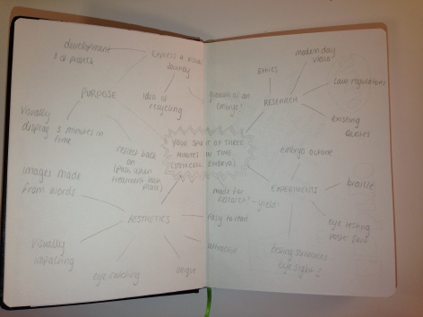
After having picked my topic, I then went onto brainstorming some of the ways in which I could communicate the subject by using type. I covered some experimental things such as braille, making an eye testing poster with the snellen font and make an embryo outline by using type.

I jumped straight in with some experimental typographic drawings, thinking how I could make the leaflet interesting without being offensive or too ethical. After these pages I felt as though I had covered most of the obvious images that spring to mind when thinking of embryonic stem cells so this was the point of which I then went on to do some more research.

IMG_0899

I decided to research exactly what stem cells are and the stages of which they transform into an embryo. This was incredibly helpful as it helped me visualise the process which is undertaken. From this I then had the inspiration as to whether or not I could do something with the letter C for cell or E for egg. I originally used the letter C to show the replication of the cells for them to reach the blastocyst stage (ball of cells) of which the stem cells are extracted. With this knowledge I was then able to further my experimentation of what I could do with my final piece of artwork. Below are the sketchbook pages followed on in a chronological order to show my thought process and how I ended up with my final design idea.

Whilst figuring out the layout of my leaflet I decided to take a look at some books which have similar aspects to the work I am doing which could hopefully give me a redefined structure to my artwork. One of the books I found which was of great help was the book – Philographics: Big Ideas in Simple Shapes by Genis Carreras. This was all about using shapes to make a creative visual piece that represents the typography. Some of these simplistic shapes were then incorporated into my work later.

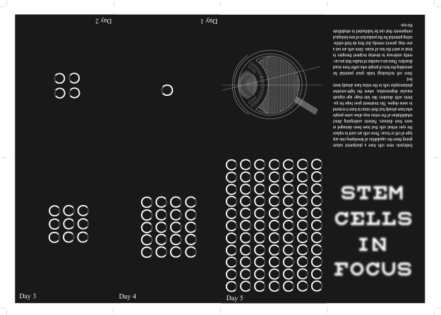
After all the drawing, I then decided to take my work onto the computer to see if I can make some of my initial design ideas work. As you can see below I have comprised the letter C to make the actual shape of the cell by making a strip which is slightly more opaque to make it a complete circle but the letter C is still visible. From this I then looked at layout and how  I wanted to represent the idea of multiplication. CIRCLE

At first I wasn’t sure what colours I wanted to use for my leaflet so I then proceeded on to try out a variety of colours to see if there was one that stood out well. In the end I decided to stick with black and white as they are the two colours which fit the best with my idea; the black represents the death of the embryo and the white in contrast shows the innocence of the embryo, White can also represent a successful beginning.

Still being unsure of what my message was I was still on the idea of creating an eye test typography piece for my title page by using the Snellen font (which is used in the official eye site testing). With someone reading this at the turn of the next century I thought it would be a good idea to have “Can you see this?” as my message. Because by this time if they can, there would be a good chance that they or someone they know would have had the stem cell treatment.

eye

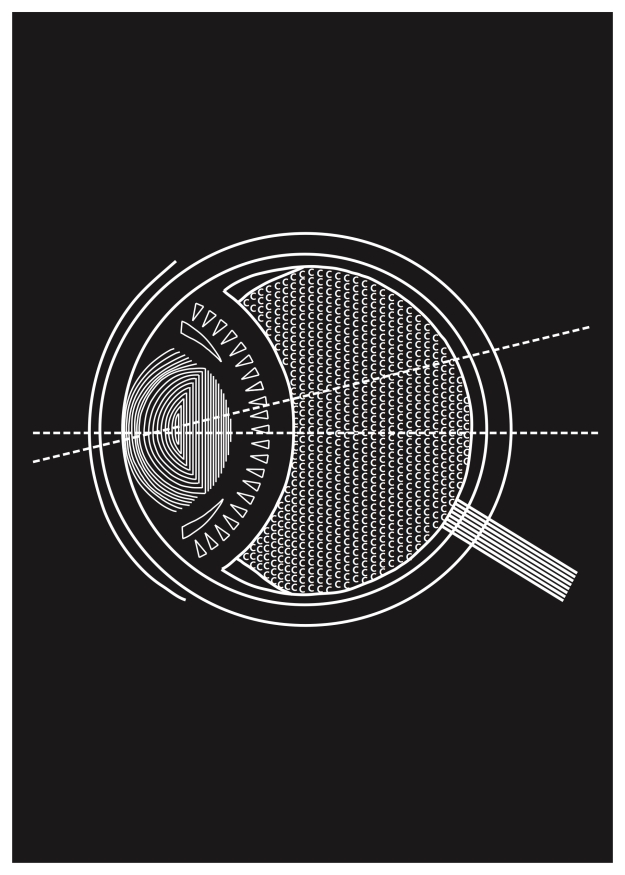
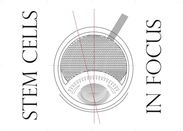
One of the illustrations I had originally drawn was of an eye, to which I then came back to with the idea of the “in focus” theme. I decided to draw the eye up on illustrator to see how effective It looked in comparison to the rest of my work. This illustrated eye does still have the letter C incorporated into the main body meaning my work had a good running theme throughout the pages. Below is my final leaflet, poster design.

roberts15007282roberts1500728Type Density

It is the overall look of a page/screen on how you react when looking at text. This is known as typographic colour. This refers to the way in which your eye combines both the positive and the negative shapes on the layout and perceives it as some specific value of grey.

Typographic colour is an important consideration as it can act as an invitation or deterrent to read text, it can alter our attitude to what we are looking at, or it can also be used to create quirky and inspirational typographic imagery.

This workshop we did addressed the more experimental side of typographic diversity by encouraging us to translate a tonal palette of photographic light and shade into a palette of typographic density.

We worked in groups, using the image of housing along the canal in Amsterdam that we were provided with to map the shape and form of the different light and dark areas in the image.We had to match the examples of typesetting we were provided with from chopped up old books to distinguish the different shades on the image. We then started to build a typographic collage.

IMG_0374


Design Publication Ideation

Print media is where it all began. The way we are reading things is ever changing from newspapers, magazines, books to print, mobile and apps. Design publications appear in a diverse variety of themes and titles. However with the more contemporary upcoming themes hardcopy publications in a physical form offer a tactile experience that can be most appealing, whereas online versions potentially give a different user experience.

Some interesting magazines include: CMYK, Domus, Eye, Creative Review, Print, Graphic Design USA, Graphis, Wrap, Uppercase, Parrett, Visible Language, Idj, Communication Arts, Novum, Pop, Little White Lies, Big issue, Dezeen, Icon, Design and culture, Adbusters, Printmaking, Blueprint, Anorak, Selvedge, Form, Article, Design Edge Canada, Desktop magazine, IDPURE, Aesthetica, Book 2.0, Varoom, Print

Magazine and newspaper publishers also produce media packs which provide information about their publications. Information includes the magazine profile/personality; target audience; circulation figures; competitors; advertising rates etc. It provides information for potential advertising clients and valuable information for researchers.

Social grades

Social grades were originally created by National Readership Survey to classify readers, but they are now used by many other organisations for marketing purposes. Social grade is a classification system based on occupation and it enables a household and all its members to be classified according to the occupation of the chief income earner (CIE).

https://www.ipsosmori.com/DownloadPublication/1285_MediaCT_thoughtpiece_Social_Grade_July09_V3_WEB.pdf

Grade based upon – Head of household/ main income earners occupation

A     Higher managerial, administrative or professional (solicitors, chief executives)

B     Intermediate managerial, administrative or professional (upper class)

C1  Supervisory or clerical and junior managerial, administrative or professional (nurses/teachers – middle class)

C2 Skilled manual workers (plumbers, electricians)

D  Semi and unskilled manual workers

E Casual or lowest grade workers, pensioners, and others with no independent income (pensioners)

These aproximated social grades is a socio-economic classification produced by the ONS (UK Office for National Statistics) by applying an algorithm developed by members or the MRS Census & Geodemographics Group.

http://www.ukgeographics.co.uk/blog/social-grade-a-b-c1-c2-d-e

With this background information we were then set the brief which is as follows:

Develop ideas and a proposal for a new, creative and innovative print design publication (magazine) for designers. The publication should appeal to designers across a variety of disciplines (such as those at AUB).

  • Consider current design publications available – identify where a new publication may fit in the current market. Chart out the publications potential competitors and include information regarding their readership and circulation figures (use media packs etc)
  • Identify the potential target audience that your publication will target and identify with their profile (age, interests, social grade, needs)
  • Consider the the publications unique selling point
  • Consider the publications defining characteristics; personality, ethos..
  • Create a name for the publication
  • Consider the frequency of the publication – monthly etc
  • Create a front page strap line for the publication – something to capture the readers attention
  • Consider what the magazines content may be – regular features? guest authors?
  • Consider size, shape etc of publication
  • Identify potential advertisers that could advertise in the publication

From this we started off with looking at existing magazines for inspiration on layout, paper texture, content, placement of advertisement & what to advertise. Our group decided that we liked Aesthetica and IDPURE for inspiration on our design publication as they both had many qualities of a high standard in which we were interested in using in our own.

After brainstorming the publication (see presentation below) we then did some experimentation with the layout to see which would be the most eye catching/ appropriate front cover for our Graphique magazine.

IMG_0877

After feeling like we had fully thought out our design we were then asked to present it to the year in the lecture hall. The powerpoint we used can be seen below, our pitch lasted a total of 3 minutes.

AUB’s Museum of Design in Plastics (MoDiP)

This session provided an initial introduction to design and gave us the chance to use object based learning when studying many of the artefacts from AUB’s Museum of Design in Plastics. The day was based on expanding our knowledge of design, developing our skills and experience in team work, researching skills, time management and object analysis.

Working in groups of 4 we were asked to consider, research and evaluate the grouped objects and undertake wider contextual research to identify further information about each example we were looking at. This not only made us really have to think about what some of the objects purpose was but it also gave me a huge insight into all the different things that could be made from plastic and how the different groups of plastics altered the textures and appearance between the objects. This was often the case when looking at toilet brush holders, the design and appearance often varied hugely just due to the difference in material used.

The first design analysis and evaluation I did was looking at a toilet brush which was designed by the company Alessi between 1990-1993. I got the information off the modip site where I found out far more information on the product.

“This Merdolino toilet brush and holder shaped like a plant growing in a pot and made of injection moulded polypropylene, was designed by Stefano Giovannoni for the Italian company Alessi in the 1990s. Alessi commissioned Giovannoni to design a range which was contemporary and fun. Merdolino translated from French simply means ‘poo mover’.” http://www.modip.ac.uk/artefact/aibdc-000991

The second product I looked at was a vintage wool holder made by universal plastics. The materials used is plastic bakelite, PF, phenol and formaldehyde to give it the shiny rounded finish. The simple design fits well in the hand and still works to an effective level. The age of the item is approximately around 1950-1959.

“A spherical yarn holder with a hole in one side for the wool to come through and a ribbon on the other for the user to hang over their wrist.”-http://www.modip.ac.uk/artefact/aibdc–006357sa

Digital Media Bitmap Graphics

The core of this project has been solely focused around the fact that these days, nearly everything you make as a designer ends up on screen, either designed for screen or developed on screen. This work has helped to give an idea of how the core of our visual work is made and combined of pixels to make a bitmap.

What is a bitmap?

When taking a photograph you are automatically creating a bitmap graphic. These are comprised of many tiny parts known as pixels, which vary in colours and have the possibility of each individual pixel having the ability to be edited. As each pixel is saved individually the image tends to have a large file size however if you try and resize the bitmap it will tend to lose its quality. You can see these pixels in an image if you zoom in really close which allows the individual squares to become apparent. See example below.
Well known Bitmap Graphic Designers

Susan Kare 

According to the Museum of Modern Art in New York, Susan Kare is “a pioneering and influential computer iconographer. Since 1983, Kare has designed thousands of icons for the worlds leading software companies. Utilizing a minimalist grid of pixels and constructed with mosaic-like precision, her icons communicate their function immediately and memorably, with wit and style.”

She began her career at Apple Inc. as the screen graphics and digital font designer for the original Macintosh computer. Kare believes that good icons should be more like road signs than illustrations, easily comprehensible, and not cluttered with extraneous detail. She often observes that just because millions of colours are available, every one need not be used in every icon, and that when icons are meaningful and well crafted, they need not to be frequently redesigned. – http://www.kare.com/about/bio.html

Here are some examples of the icons that she has made which are mostly well known to anyone who uses technology or social media.

Screen Shot 2015-10-29 at 16.29.58

Paul Rand

“Don’t try to be original. Just try to be good.”

Born in Brooklyn in 1914 and educated at New York’s two great art schools, Pratt and Parsons, Paul Rand was a monolith of US corporate design whose body of work – which included identities for the likes of IBM, abc and Steve Job’s NeXT – is as fresh now as it was when first produced in the mid-late twentieth century. http://uk.phaidon.com/agenda/graphic-design/articles/2012/november/13/paul-rands-greatest-hits/

These two designers were the foundation to my inspiration mainly because of their ideologies behind what they do.

Hand drawn bitmaps

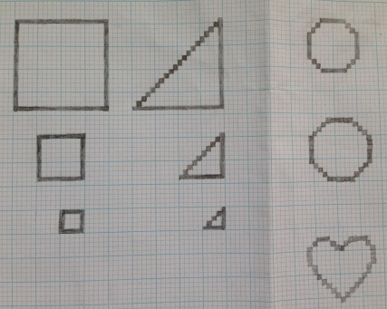
This project started off with a simple drawing exercise to familiarise us with pixels. We were asked to draw a 20×20 Square, Triangle and Circle then half the size each time. This left us stopping at 5×5 as the image would no longer be decipherable. This exercise aided us to understand how pixels are mapped out on a page and are placed to create different shapes whether they are rounded or straight.

IMG_9805

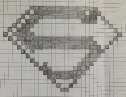
Having explored the different uses of pixels on graph paper we were then asked to draw something in front of us in the room. I decided to draw the superman logo, which I noticed was on someone’s bag meaning I had to scale it up rather than down making it the opposite of what I was previously doing. Many aspects of the logo were frustrating to draw as the pixelated version was not going to have the organic natural flow on the “S” which took me a while to get to grips around how it was going to look slightly different as only whole squares could be used. Depending on what sized squares were used altered the final look of the image changing from a bold and chunky finish 32×32 with the big squares to a light and detailed finish 16×16 with the smaller squares. Although it looks quite bold the bitmaps present on the screen are presented at a much smaller size making them sharp and clean cut.

IMG_9808 copy

Moodboard visual reference

After the experimental bitmap work we were asked to choose a theme of which we would produce a set of bitmap icons. From looking at loads of different bitmap examples on Pinterest I finally settled on the idea of Alice in Wonderland. See mind map below.

Bitmap theme idea exploration

Bitmap theme idea exploration

Having chosen Alice In Wonderland I then went and gathered loads of outlined pictures from the most iconic items/ characters for the theme. This left me with a nice array of simplistic images of which I could alter and make into my own bitmap icons (Figure 1). From this I then decided I should look back to the original illustrations to see how detailed and different they are in comparison to the modern day cartoon ones (Figure 2). Figure 3 shows the most beautiful illustrations of alice in wonderland which have been done by Lisbeth Zwerger in 1999. These were a great inspiration to see how the original illustrations were interpreted to create these clear and colourful bitmap graphics. I used the mood board and visual reference to give me a physical example and to guide me on what my bitmap graphics should be and to ensure they have the contextualised theme.

Development drawings

I initially started out with looking at the basic features that are present and can be deemed to be some of the well known symbols in Alice in wonderland such as, the mad hatters hat. (Figure 1) This started off with a very small and simplistic version of a top hat, which looked more similar to a clip art image than a real life hat. This allowed me to get used to how to arrange the pixels on the graph paper in order to make the top hat have that 3D edge. I used the more basic drawing to act as a guideline to help my bitmap resemble a top hat in which I would later alter to specifically make the iconic mad hatters hat. From this I sketched out a top hat on the graph paper and shaded in the squares where the lines were placed giving me my final image. From this I found that sketching the graphic first made making the bitmap image a lot easier and faster with the end result looking far more realistic and professional.

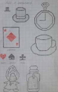
I then went on to draw some of the other iconic symbols such as the pocket clock, tea cup and playing cards. I even managed to draw the oyster in a bitmap form however I did not leave enough room for the face to be drawn on correctly with pixels. This was the same case with the Drink me bottle.

My bitmap graphics were very detailed and true to their source meaning they would be far too complicated for them to be made into a 16×16 or even a 32×32 bitmap, which was pushing it. (Figure 2) So although they looked really effective and great they needed to be made far simpler to be effective as icons. This is where I took some of the more simple designs and contextualised them to ensure the viewer would know exactly what the visuals of the design are communicating. (Figure 3)  My final page of designs had been narrowed down to icons that would look effective at a small size but are also decipherable as items from the alice in wonderland classic.

IMG_9910 copy IMG_9915 copy IMG_9912 copy

Figure 1                                         Figure 2                                         Figure 3

Processing Programme for BitMap Production

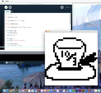
Mad Hatters hat on the Processing software

Mad Hatters hat on the Processing software

In order to make our Bitmap images on screen we were inducted on how to use a programme called processing which used coding to create our icon creator. This was very much typing in random words and punctuation to give the computer commands, which was very strange that certain characters would perform functions. A huge novelty of this project was that instead of using pre designed software such as Photoshop we would instead be making our own tool that we would use to design our bitmaps.

We programmed things such as colour changing through keyboard shortcuts, saving the design, creating an undo button and having the ability to alter the size of the grid by choosing which dimensions would be used. (Switching between a 16×16 grid and a 32×32).

We were able to create our own colours that we could use but the codes for each colour needed to be found. For example the yellow was made up of (255,255,0) which is a mixture of the RGB colour palette. For most of the designs I stuck with the RGB colours along with black and white as these are what I thought worked best with my Bitmap icons.

Experimental physical media

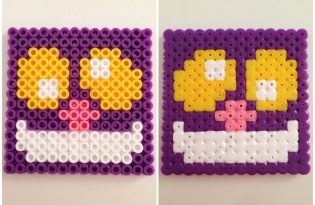
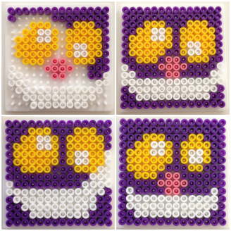
From drawing the bitmaps we then went onto making physical versions by using Hama beads. These creative toys originally designed for children had a profoundly similar aspect to the idea of pixels being put together to make a graphic image. The only real difference between a bitmap design and the Hama beads is that the pixels have a hole in the middle, making the design seem a little different and it tended to look better from a distance. This was a task as the Hama bead boards we used were 14×14, which is even then slightly scaled down from the 16×16 designs we had made.

Trying to choose which design I should pick was tricky as most of them had a great level of detail and thus trying to rescale them down to that small size was almost impossible. Things such as the mad hatters hat, I had a great deal of difficulty trying to distinguish it from a normal top hat. The final Hama bead piece was just a case of experimenting around with the beads in different positions to see which looked the most effective and recognisable for the icon.

With a limit on the number of Hama beads, we were only able to iron 1 design in total. After experimenting with the shape of the Cheshire Cats eyes and mouth I finally came to a solution on how I was happy with the placement of the beads.

Not only did I try and do the Cheshire Cat I also experimented around with the playing card suits, the rabbit, the Cheshire Cats mouth and the eat me and drink me designs. However the board was far too small for me to scale down the text so these designs were impossible.

IMG_9861

Figure 1

Figure 1 shows the various mouth alterations I tried out to see which was the most effective in representing the Cheshire Cats mouth. Not only did I change the depth but I also looked at modifying the width in the attempt to capture the smile correctly in the icon.

FullSizeRender 2

Figure 2

Figure 2 expresses my attempt at trying to see if I could do the Cheshire Cats mouth well enough for it to be recognisable by itself alone but I realised unless it was placed with a set of other icons it almost just looks like a slug. The rabbit did work but it didn’t look like the one specifically from Alice in Wonderland which put me off the idea of choosing this idea to iron.

IMG_9848

Figure 3

In figure 3 I experimented with the playing card suits but for a realistic appearance I needed to add the number in the far left corner. This was purely experimental to see how well they turned out in a pixelated form. I think they look really effective however they needed to be placed as a set so as I could only iron 1 I decided not to choose them.

IMG_9877

Final bitmap design

These are my bitmap designs I experimented out on the processing programme. For some of the designs I decided to experiment with 16×16 and 32×32 which is why some are in colour and some of the same image are in a more detailed version in black and white. Things such as the hat, cheshire cat and rose were all too complicated to resize them down to 16×16 meaning they had to be in black and white, however I think they would have been made even more effective if they did have a splash of colour on them. I did find in general the 32×32 sets of icons worked far better by giving a more competent finish. When placed all together it is certainly clear of the theme, meaning my icons are coherent to a degree.

Final set of Bitmap Graphics

IMG_9908

This is my final set of bitmap graphics of which I thought best represented the Alice in wonderland theme the best. 4 of the icons could be seen just as the object but with the placement of them all together it makes the theme easily decipherable.

Notion of Creativity

Tuesday 13th October 2015

The lecture looked into the notion of non-verbal & Interpersonal communication, Body language and presentation techniques. It was to consider how we read each other and to work out how we best communicate in a variety of contexts. This session was to explore the idea of creativity by using play and construction.

IMG_9783

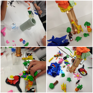
Being set into groups of 5 with a paper and pen we were asked to “Define creativity” through brainstorming. We were asked to consider what ENABLES creativity and what BLOCKS creativity with the target audience of graphic designers.IMG_9727Each group were given a range of materials to use to express creativity in however way they wished. Our group received a variety of papery materials, a long tube and a tub of plasticine. Originally we started to carve shapes into the tube to make sections in which the light could enter and then cover these areas up with thin layers of plasticine to make a light globe piece when a light was shone from inside.

IMG_9795

However as there were 8 of us it meant we soon had rolled out lots of colours to use to cover up the holes in the tube meaning most had nothing to do which lead on to the creative use of plasticine. I decided we needed to use the materials in some sort of way as well so ended up making a tree, which then sparked all the making of the animals. The Time-lapse video below shows the stages of the group making the final piece.

IMG_9794IMG_9796

Graphic Design Classics

Tuesday 29th September 2015

From having an introductory lecture based on “What is Graphic Design” it revealed how the design history, visual culture and creative disciplines all have an underlying connection to our studies. The group activity we were given was to investigate Design Classics and look at what examples of graphic design you can identify as being visually powerful. After being assigned a number that corresponds to a well known brand I was given the example Burger King of which I wrote up a brief summary on a luggage tag.

IMG_9772

IMG_0114

A few key points from my research that I found that the Burger King logo had incorporated, were things such as:

  • Simple in design
  • Eminent not only amongst the youth but also appeals to adults
  • Most recognised fast food chain
  • Standardised look
  • Emblem has proved to be a guarantor of the quality & good will of the brand

These were all features that would stand out as being a well designed logo, making it interesting to take these points into consideration so I can use them in the future to help me when it comes to designing my own.

London Landmarks

Friday 25th September 2015 – London, Southwark

Landmarks may be classified according to many attributes, including visibility, distinctiveness and their persistence in the environment in which they are present. Our brief was to consider what key landmarks are present in a distinct section of the Southwark area, the vicinity is marked on the map in the image (see below). Within the marked boundaries a few well known landmarks such as Shakespeare’s Globe and the Millennium Bridge were clearly visible on the map making them obvious things to choose for Landmarks. However I decided I wanted to find landmarks which are seen every day by commuters and the people who live there which are noticeable and recognised but also enables someone to establish their location. On this trip we were asked to develop & document our ideas and experiences whilst in London and visit 3 of our five landmarks chosen to record the senses which were engaged.

IMG_9298 copy

I chose the Millennium Bridge as one of my landmarks in the Southwark area as its creative collaboration between architecture, art and engineering has helped to produce the only pedestrian footbridge in London. Through connecting the city and St Paul’s Cathedral with Bankside it has offered more routes into southwark and thus revealing areas which were not often seen. One of the many things that makes it intriguing is that structurally the bridge pushes the boundaries of technology and against all odds the bridge is still present to this day.

southwarkIMG_4991london

London buses are very much associated with the culture of London and have become an iconic symbol in representing the city, just like phone boxes & black cabs. From supporting the war effort in 1914-18, representing design classics and providing blank canvases for art and adverts to be displayed on, the bus has become part of the cultural identity of London. Tourist gifts have resulted in people buying key rings, mugs, postcards and tops with the most iconic symbols on that they believe suitably represents the capital of Britain.

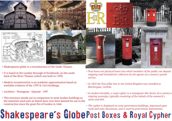
landmarks london busShakespeare’s globe has a lot of historic significance and is clearly recognised as an iconic building. Today the reinvention of the globe theatre serves as one of the many popular tourist sites in London and the new globe stands just a few hundred yards from its original site. The historic value this brings to the city gives an idea of what London would have looked like between 1599-1613. William Shakespeare is widely regarded as the greatest writer in the English Language and is one of the most famous english poets, playwrights and actors in the Elizabethan Era. The globe theatre is still significantly associated with William Shakespeare where many of his well known plays were performed.

globeIMG_9003 london trip

Royal Cyphers are monograms of a country’s reigning sovereign, which typically consist of the initials of the monarchs, The title is abbreviated as R for rex or regina (Latin for king and queen). The present Queens cypher is EIIR – standing for Elizabeth II Regina. These being placed on lamp posts, post boxes, buses, money and buildings all make the location recognisable and allows people to establish the part of the UK in which they are in.

post boxlondon trip

Railings are a peculiar landmark in their own right. Since during the war where many rails were stripped down and sent off to be scraped and used to make war weapons it was only the richer places of London in which they still stand. As there are very few railings left in London these alone give a direct indication as to what part of London you may be in.

References:

http://www.urban75.org/london/millennium.html

http://www.ltmuseum.co.uk/assets/downloads/pdfs/Symposium_SocialHistoryofBus.pdf

http://www.artlyst.com/events/symposium-the-social-history-and-cultural-significance-of-the-london-bus-london-transport-museum

http://www.shakespearesglobe.com/about-us/history-of-the-globe/rebuilding-the-globe

http://hotmonarchy.com/resources/symbols/